7 Steps To Reduce Cart Abandonment Rates

In fact, many cases of shopping cart abandonment can be rather easily remedied. The following statistics are telling of reasons behind these high rates, and how simple a fix they can be.
- 35% of online stores don’t feature security information for shoppers.
- 24% of consumers abandon a cart because there was no delivery date offered for the goods.
- 55% of cart abandonment rates are due to the cost of shipping.
- Over 80% of shoppers would make more online purchases if free shipping was being offered.
How Zappos Does It
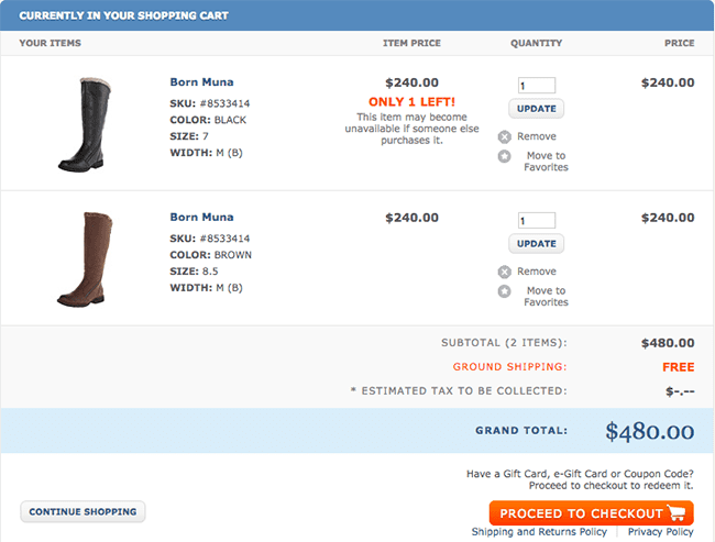
As one of the leaders in ecommerce, and as a store that sets the benchmark for free shipping and hassle-free returns, it only make sense to use Zappos as our poster child here. Zappos populates the shopping cart with thumbnails of the products that have been added and the cost that they’ve added to the shopping cart. This allows consumers to review their purchase once more before they tender payment.
In the example screenshot provided below, you will see that two boots have been added to the shopping cart, both which are different colors. Zappos assures that the shopper knows which boot of which color is in the shopping cart and how much that boot costs. Basically, if you add the same boot two times, you will see it stacked in the shopping cart to better illustrate your purchase. Make sure your shopping cart offers this functionality to decrease cart abandonment.
Furthermore, making changes to your Zappos cart on-the-fly is simple and easy. Just click on the image of the boot you want to update. It will let you make any changes, remove the item from the cart, increase quantity or even revisit the product landing page. It’s the quintessential example of shopping cart synergy.

Call-to-Actions Matter
Think of your call-to-action as the final push towards the sale. It often means the difference between a conversion or an increased cart abandonment rate. Customers that shop online typically make last-second decisions on whether to buy or to abandon. With a clear call-to-action, you are giving them every reason to buy; and not the latter.
Basically, make sure shoppers are not distracted when it comes time to push the “Buy Now” button. One example is that some shopping carts populate the surrounding areas with social buttons for sharing, or annoying popups that request newsletter subscriptions or surveys. Indeed, such things are better left for after the purchase has been completed.
Generally speaking, you want to stick with one clear-cut call-to-action button. It should lead the shopper directly to the purchase page, minimizing the steps necessary to complete the transaction. If you really want to see how effective your call-to-action buttons are, squint at the screen until it’s blurry and see if the button still stands out. If it doesn’t, it’s time to make some small changes.
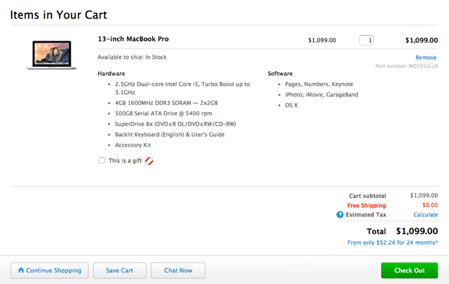
Apple’s shopping cart – pictured below in the screenshot we’ve provided – provides an ideal example of how to make an effective call-to-action button. The button is bright green and is visually different than the rest of the cart, with a simple “Check Out” label. There several other buttons here, too, which include: “Continue Shopping,” “Save Cart,” and “Chat Now.” These secondary buttons, however, are silver, so they don’t detract from the primary button.

Shipping Cost & Taxation
One of the primary reasons why shoppers abandon carts is due to added costs that they had not envisioned before shopping. Sure, there will be some added cost for taxes and shipping. But you don’t want to surprise shoppers later on. Rather, you want to state these costs upfront and in the cart as soon as possible.
Make sure that the cost of shipping and taxes are factored into the final cost that’s presented to the customer as early in the sequence as possible. This should be a number that does not change when they proceed to the checkout. This way, shoppers are not surprised at the final price they are asked to pay; because they’ve been aware of it all along.
Delivery Time
Another aspect that can affect cart abandonment rates is the speed of delivery that’s being offered. E-retail customers don’t get to walk out of a store with the product they’ve just purchased. Therefore, delivery time is an incremental aspect of attracting more sales.
Recent studies show that at least 25% of shopping cart abandonment rates are simply due to no expedited delivery option being offered. While it might be difficult to procure an exact date inside of the shopping cart, it’s OK to estimate to earn a customer’s business. Saying something simple like, “Ships in about three days, gets to you in about six,” can help secure more sales than you’d think.
Make the Cart Easy to Edit & Update
A shopping cart serves a number of purposes. One of them is to allow customers to preview items, cost, taxes, shipping fees and so forth before they checkout. It also allows the customer to edit the cart to make any updates or changes before they buy the items they want.
Make sure that shoppers at your store can easily update the quantity of items using a scrollbar, check box or up/down delimiter. A simple product removal tool should also be featured – like a trash can icon or box with an X – so that products can be removed without much effort.
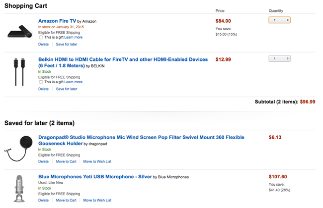
Amazon is one of the largest ecommerce stores out there, doing billions in sales each year. The screenshot below of their shopping cart demonstrates how easy and convenient that it should be to remove items, update the cart, add more items or make other changes. Shoppers can update quantities by using a drop-down, they can save the cart for later or they can even select that the item as a gift for another person.

Security Badging
With millions of consumers getting defrauded by criminals each year, it’s of a big concern to online shoppers. It’s your job to assure them that their transaction is safeguarded on your website. Doing this requires that you have site-wide SSL encryption, and that you are meeting biding security standards, while prominently displaying a badge that will put shoppers’ minds at ease.
Somehow, 35% of online stores still don’t display security badging to encourage sales. Popular encryption services like Comodo and Norton’s Verisign are cost effective and simple to install. This one trick here will help your customers feel more secure when at your online store, and can serve to increase conversion rates exponentially.
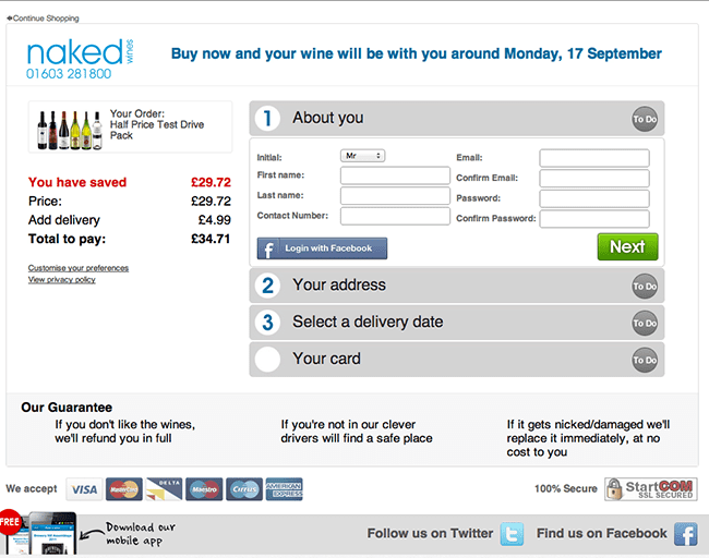
In the screenshot below of the Naked shopping cart, you can clearly see that their shopping cart adheres to everything we’ve just imbibed. What’s more, in the lower right corner, just beneath where you enter your credit card info, you can see a clear security badge by StartCom assuring shoppers that their transaction is safeguarded.

Display Your Contact Info
Customers need to be assured that they are being put first when choosing to shop at your store. This helps them know that you are ready to help, that you are a legitimate business and that you care about their business. A toll-free contact number should be featured on your header or footer with an available number in the cart for customers to call if they have an issue. You can take things a step further by adding a live chat feature, which can cost you more man hours to operate.
Optimizing your shopping cart to decrease cart abandonment rate centers upon predicting common customer woes and resolving them in advance. By doing so, you can assure that the prospective customer has no objections they can think of, leading them to press that “Secure Checkout” button and tender the sale with confidence.
Share On:


