8 Methods Ecommerce Sites Use to Beat the Odds

Do you know what methods the top-selling ecommerce sites use to move more products and fuel conversions? These carefully guarded industry secrets are the recipe for success at major online stores. They can be applied to your store to help attract new customers, improve retention, decrease cart abandonment rates and increase conversions. We’ll help you understand what they are by providing more depth and detailed screen shots of the top eights ways that you can supercharge your sales funnel.
Unique Value Proposition
What’s your store’s Unique Value Proposition (UVP)? In essence, ask yourself why do shoppers want to buy something from your store? Is it because you offer free shipping, hassle-free returns, a price-match pledge or next-day delivery? This screenshot of AO.com demonstrates how a UVP placed coyly at the top of the website page can help increase your goal conversion funnel exponentially, and simply by assuring that customers are well aware of what sets your store apart from the rest.

Clean Home Page Design
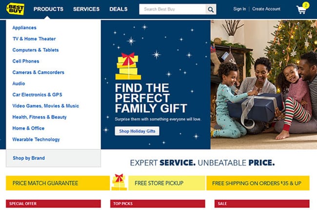
Shoppers are impatient and have plenty of options with online stores. They are just a click away from leaving your site, or a click away from making a sale and converting. Ensure that your home page is free from clutter and that it loads fast. Make sure that your customers have access to easy navigation options, too. A clear-cut example of this can be found in the Best Buy home page screen shot below.
Contextualizing Product Layout
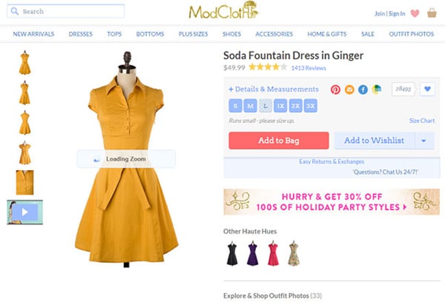
Since shoppers are unable to actually try on a garment or touch a device they want to buy, you’ve got accommodate them for this lacking. Instead, you can utilize numerous screenshots, zoom images and even a video, as the ModCloth screenshot demonstrates below. Doing so has been shown to increase sales and reduce returns because customers are able to better imagine whether or not the products they are shopping for are appealing.
Filtered Navigation
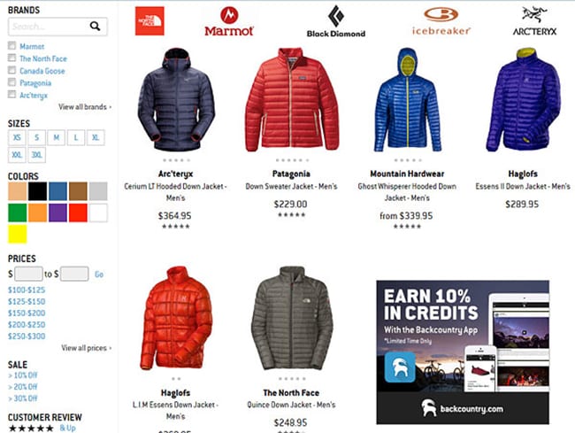
The last thing any shopper wants to experience when visiting your store is shoddy navigation. Instead, the navigation should clean, clear, filtered and simple-to-use. Visitors should be able to filter the results by searching for attributes, by category or by search. In this Backcountry screenshot, you can clearly see how simple they’ve made navigating the nested product categories and subcategories.
Eye-Opening Call-to-Actions
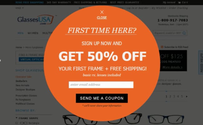
A call-to-action is an integral aspect of driving more sales. They are commonly used to attract sales from new visitors and grow organic opt-in email and newsletter lists. The GlassesUSA screenshot below demonstrates how a simple, elegant call-to-action pop-up can serve to offer new visitors a discount on their first purchase while requesting that they opt-in to the organic email list.
Cross-Selling
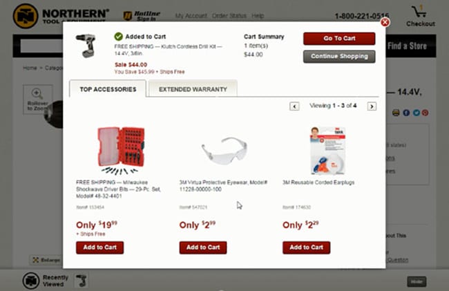
One of the most effective methods of increasing the average order value is found via the method of cross-selling. With ecommerce, you’ll want to ensure that your shopping cart has a cross-selling feature. In the Northern Tools example below, you can plainly see that related accessories are featured after drill has been added to the shopping cart. A number of studies purport that this method grows the order value substantially.
Personalized Story
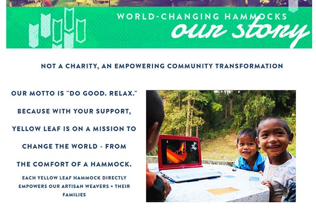
Your visitors want to connect with your brand. But they won’t be able to connect with it if you don’t take the necessary steps to personalize the experience. In this Yellowleaf Hammocks screenshot below, you can see that they use their “about” section to tell the company story in a personalized manner. This same vibe is exuded throughout their website and within their social channels to personalize the experience for shoppers.
Reengaging Abandoners
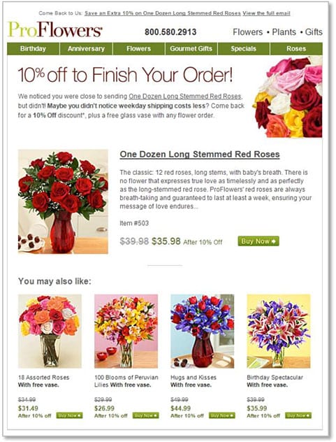
For those who do abandon their cart before placing an order, you still have one last chance to reengage them with a value option via a shopping cart abandonment follow-up email. As the ProFlowers screenshot below demonstrates, a 10% value is offered to customers who abandon their carts, encouraging them to convert on the sale for an added value. It’s a great way to capitalize on sales that would have otherwise not converted.
Share On:


