Inspiring Action: A CTA Guide for Your Online Store

Enter the call-to-action, the simple method for giving prospective customers a direction and reward, earning you sales in the process. It’s a tactic you encounter on a daily basis, but you might not have recognized it before. Regardless, using calls-to-action is a powerful, proven strategy for e-tailers.
Read on to learn more about the CTA.
What Is a Call-to-Action?
The call-to-action, or CTA, is exactly what it sounds like. It’s the word, phrase or sentence(s) that inspire prospective customers to complete the desired action. Whether you’re looking for more email subscribers or online shoppers to check out your flash sale, a well-crafted CTA will nudge them in the right direction.
There’s a good chance that you see CTAs every time you go online. Website pop-ups and push notifications are two common examples that try to give direction, but even banner advertisements and enter-your-email forms are CTAs. Social media especially is full of calls-to-action on promoted posts, usually appearing as a box saying “Learn More” below the post. Many e-tailers have embraced social media advertising due to the decline of organic reach, and if you fall into that category, you are already familiar with the CTA.
Why You Need One
Think back on the times you’ve downloaded an app, subscribed to an email list or started a free trial. You were likely responding to a CTA that inspired you to complete a task in exchange for a reward that would add value to your day to day. This is the same reason you need to a CTA in all of your online store’s messaging.
Even the most interested online shoppers need a nudge before clicking “Buy Now,” which is a call-to-action in itself.
Here is how you craft a compelling call-to-action for your online store.
How to Write a Compelling CTA
The best call-to-action is one that is clear and concise. The average human attention span has dropped to a mere eight seconds, which means you don’t have much time to create a standout piece of content that will attract prospective customers. You don’t have to work within a character limit (unless you’re running a social media ad) but be aware that 55% of all page views get less than 15 seconds of attention.
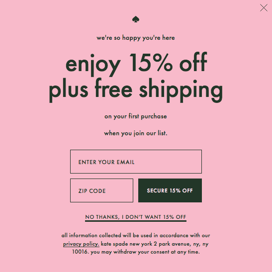
To write an effective CTA, start with an action verb. While the generic “Learn More” or “Sign Up” will certainly drive more traffic than a message without a direction, the CTA is another place to continue your brand’s story. Try to maintain your brand voice with more unique verbs. Designer Kate Spade’s site uses “enjoy” at the beginning of the current CTA, which aligns with the sophistication of the brand.
Conversely, Chubbies, an apparel company centered around retro-patterned men’s shorts, is a more laid back brand that can get away with an informal tone in their calls-to-action. Note that “get” and “submit” are fairly bland verb choices, but the message remains on brand by addressing the prospective customer as a friend.
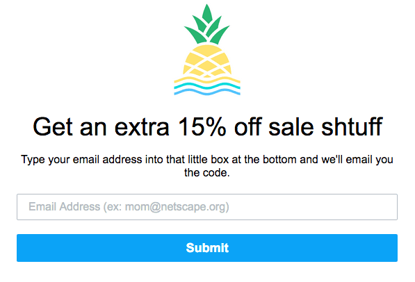
In both examples, the CTA button is in a contrasting color that catches the eye and stands out from the rest of the webpage. This can also translate to emails, product pages… or anywhere else you want shoppers to take action.
Another important component of the CTA is its descriptiveness. Both examples above tell the consumer exactly what their reward is for taking action, and they waste no time in doing so. Make sure you are especially descriptive if your CTA asks for consumer information. In the age of privacy concerns and data uncertainty, people want to know what they get in exchange for handing over their name, email address or phone number.
A compelling CTA also capitalizes on the fear of missing out by alluding to urgency. This is why flash sales are so successful for online stores and why the ephemeral social media Stories content drives conversions for e-tailers. If your CTA includes phrases like “only ten left” or “50% off until Tuesday,” it’s likely that shoppers will be spurred into action—and will be more susceptible to impulse buys.
If your CTA answers the what and why and has a clear desired result, you’re off to a great start. But you’re still not done, and here’s why: There is always room for improvement.
Split Test for the Best Results
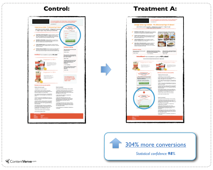
Just like anything else that’s in your marketing arsenal, calls-to-action should be split tested to fully optimize your desired result. Color, copy, placement and several other factors come into play and can dramatically affect the response to your CTA. Take a look at Content Fold, which had a 304% uplift in conversions by placing their call-to-action at a different place on their webpage.
Interestingly, Beem Digital found a 90% increase in click-through rate by changing their CTA copy from third person “start your free trial” to the first person “start my free trial.” First person phrasing makes the offer more relevant to your prospective customer and feels personalized, which is the key to modern ecommerce.
Split testing will give you the best information to inform your calls-to-action going forward. To learn how to conduct a split test, don’t miss our guide.
Drive Sales by Inspiring Action
Where traditional brick-and-mortar stores have sales consultants that gently nudge shoppers to make a purchase, ecommerce has to rely on well-crafted persuasive messages. But when done right, a call-to-action will inspire a consumer to become a customer.
Use CTAs in all of your messages for the best results. These are just a few examples to get you started:
- Site pop-ups
- Social media ad campaigns
- Email marketing
- Banner ads
- Product pages
You’ll soon be on your way to supercharged sales and a growing online store.
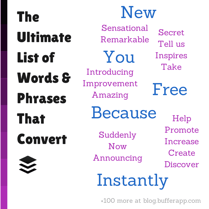
For more inspiration, don’t miss this guide from Buffer (one of our preferred ecommerce social media tools) detailing CTA words that convert.
Share On:

